
The Shining
- beththornton32
- Nov 4, 2015
- 1 min read
Recently I watched The Shining for the first time and I was extremely drawn to the cinematography of it. The colours and angles of the film really add to how the story is created and portrayed, my favourite few moments being the simplicity of watching the young boy ride around on his toy bike through meter and meters of bright geometric carpeted corridors. John Ascott, the cinematographer, uses many tecniques to engage the viewer and lead them to build fear within their own minds, giving feelings of isolation, shown throughout the simplicity of that one scene of the boy on his bicycle. The almost neverending corridors pattened with bright colours create a confusing feeling to the viewer making them feel like this corridor could go on and on. He also enhances this with the low and chlostrophobic view, following the boy as if the camera is being dragged along behind him. By doing this we feel submerged and srrounded by the walls of the hotel with repititious walls and lights agitating the mind.
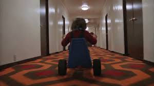
The shining also uses a lot ofs symmertry and lines throughout typically associated with clarity and perfection, yet the story we actually find out is juxtaposed to this. Ascott makes strong colour connotations with the primary colours yellow, blue and red being frequently used, especially red within the walls, the carpet, clothes and more, of which the colour red is oftern founf to represent love and passion, however in this case, displaying references to blood, anger and pain. The consistent use of these colours helps link the cinematography altogether and make it more astehtically pleasing.


Comentarios